A nonprofit's WordPress platform: built with an agency, then run and extended in-house.

TWR Web Platform

RoleLead developer, designer, and platform owner
Timeline2022–2026
StackWordPress, PHP, ACF, Sass, JavaScript

The problem

An education nonprofit needed a web platform that a small team could actually run — course pages, resources, press, role-based access — without a developer in the loop for every content change.

What I built

A WordPress theme and block system, and a design system growing out of it.

Climber Interactive, an agency, built the original theme and its first blocks in 2022 and returned for feature projects through 2024. I directed that relationship, including the scope of each follow-on engagement. From that autumn my team owned the codebase and wrote most of it: 615 of its 1,243 commits are mine.

I was the lead developer, and I designed on the site too. I hired and managed a design intern, delegated design and web work to interns and a senior designer, and reviewed what came back.

  • 16+ custom Gutenberg blocks. Each has its own field configuration, so editors compose real pages instead of fighting a generic page builder. The agency shipped the first set; I added a second wave and migrated the legacy ones.
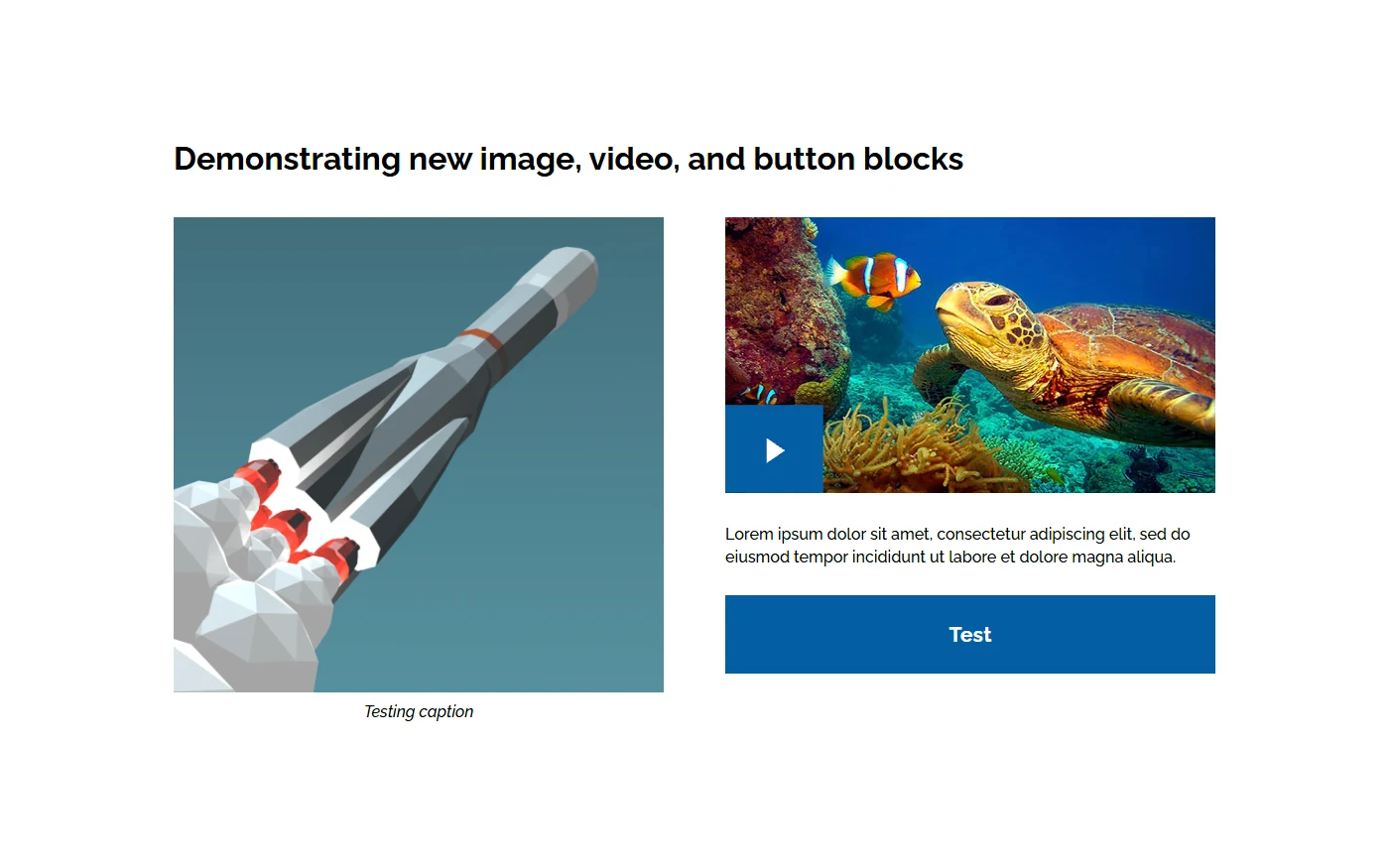
A test page on the staging site: a captioned image, a video with a play button, a line of text and a button, laid out in two columns.
A test page for the block library: an image with a caption, a video and a button, each one its own block, with placeholder content.
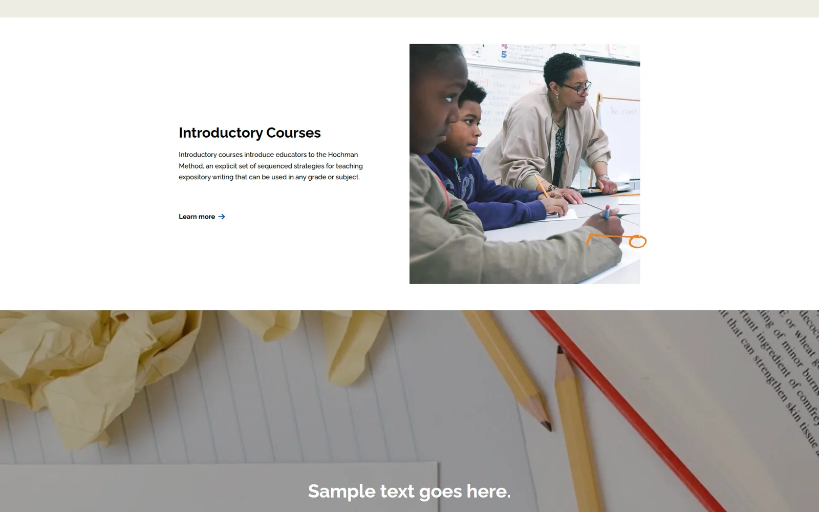
The same test page further down: an image beside a heading, a paragraph and a Learn more link, then a full-width photograph of pencils and paper with the text "Sample text goes here." over it.
Two more blocks from that test page: an image beside text, and a full-width image with a text overlay. Placeholder copy.
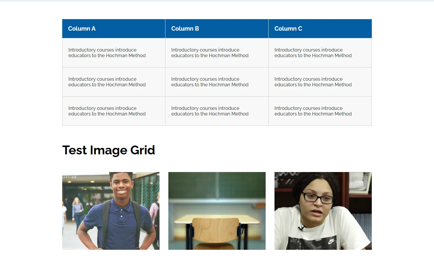
A table block with a blue header row and three columns of placeholder text, and below it an image grid block with three photographs under the heading Test Image Grid.
A table block and an image grid from the same page, with placeholder text and sample photos.
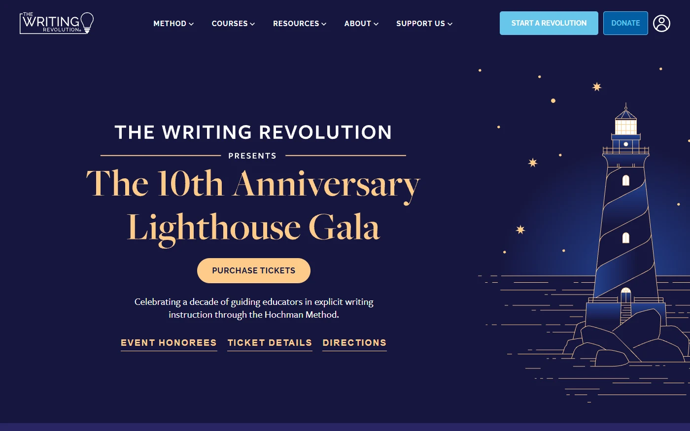
An event landing page on a dark navy ground with gold serif type and a lighthouse illustration, with a ticket button and three links under the title.
An event landing page on the platform, with its own palette and illustration. The design was the senior designer's; I built it and adapted it for the web.
  • A design system, proposed from an accessibility audit. Auditing the site's most-reused components turned up the same problem everywhere: each one rebuilt from scratch, with accessibility and modern standards re-solved page by page instead of once. Wrote the proof of concept myself, from Creative's own Figma file — then handed leadership of the real build to a direct report. The prototype and the early conversations with Creative and Marketing are theirs now, not just the easy parts.
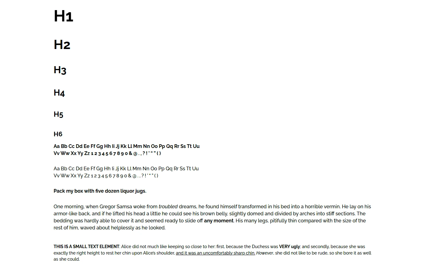
The platform's styleguide: heading levels one to six in a bold geometric sans, then bold and regular alphabets and paragraphs of sample text.
The platform's styleguide page: the type scale and text styles the blocks are built on.
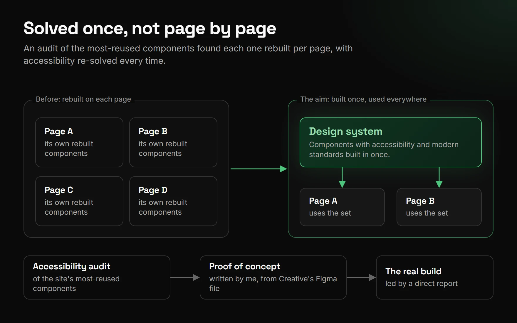
A diagram. On the left, four pages each rebuild their own components. On the right, one design system feeds the pages. Along the bottom, an accessibility audit leads to a proof of concept, which leads to the real build led by a direct report.
Why a design system. A diagram, not a screenshot: the audit found the most-reused components rebuilt page by page, so the proof of concept moved that work into one shared set.
  • Accessibility as a default, not a pass at the end. On the platform my team ran, every custom block carried ARIA roles, correct focus order and an alt-text workflow, checked against a real audit baseline rather than assumed.

How it looked

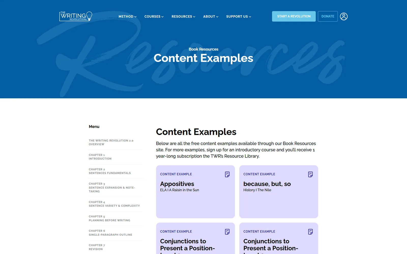
Pages from the staging copy of the site as it stood under my team. They are staging content, cropped to the page itself.
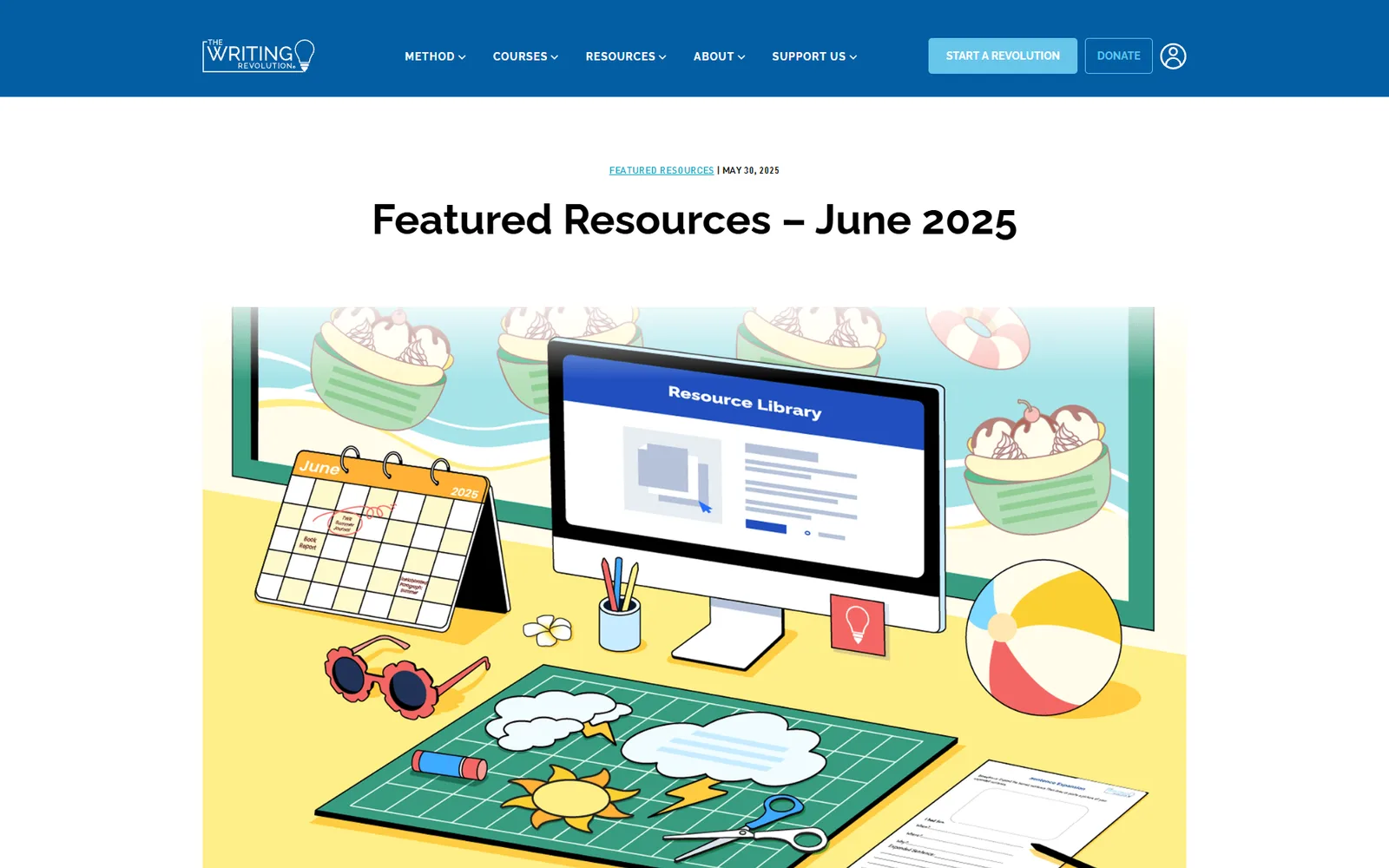
A featured-resources page headed "Featured Resources – June 2025", under the site's blue header and navigation, with an illustrated desk scene: a June calendar, a monitor reading Resource Library, a beach ball, sunglasses and ice cream sundae art.
A monthly featured-resources page, with its illustrated header. The monthly illustrations were done by a design intern I hired and managed.
A Content Examples page under a blue Resources header: a chapter menu at the left and, beside it, a grid of lavender cards, each labeled Content Example with a title and a subject.
The Content Examples listing: a chapter menu beside a grid of cards.
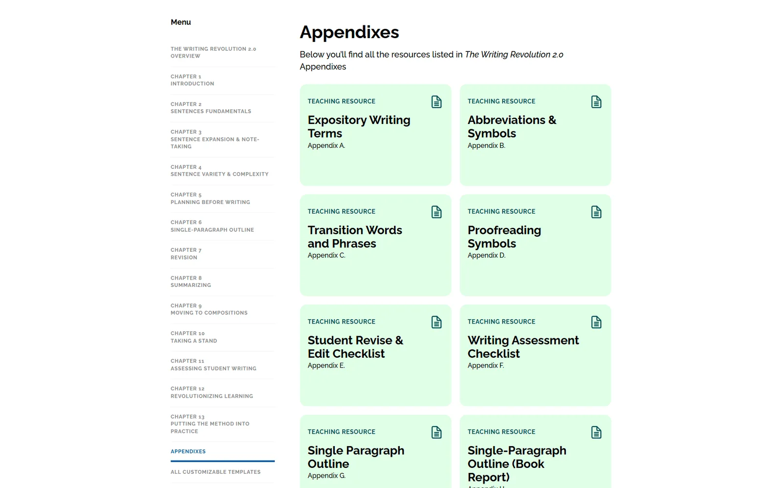
A page of cards for the book's appendixes: a chapter menu at the left and a grid of mint green cards, each labeled Teaching Resource with a title and an appendix letter.
The same listing template for the book's appendixes, in green.

In 2026

  • A sign-in flow redesigned from a spec, not a hunch. A confusing error state and a dead support link were driving avoidable support contacts — a real customer-experience cost, not just an eyesore. Wrote a six-change spec with annotated before/after mockups; it shipped as written.
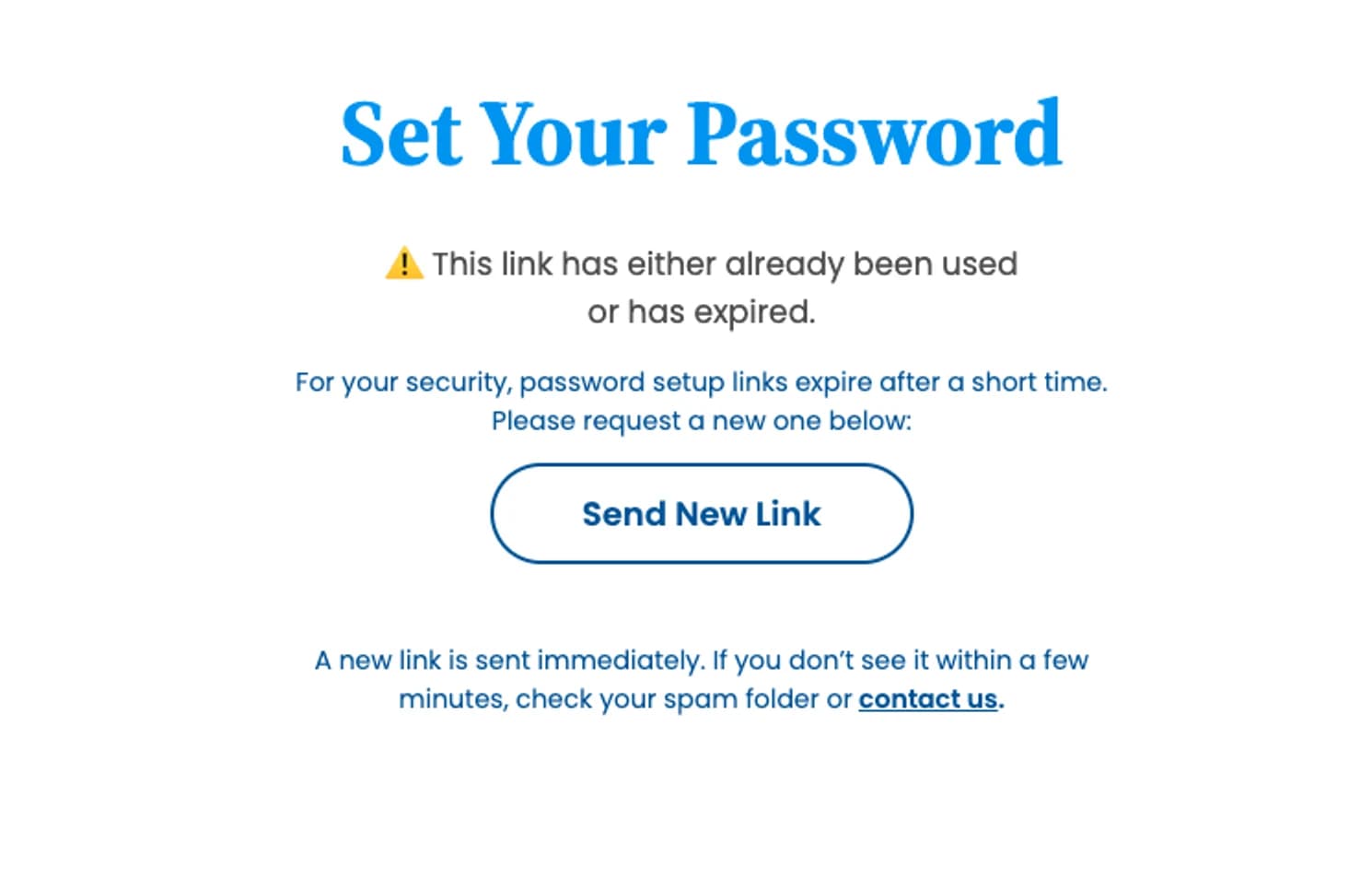
BeforeAfter
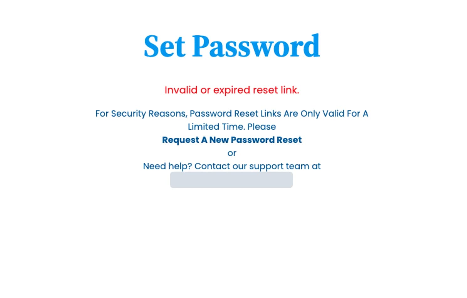
The expired set-password page, before and after the spec. The dead support address in the before is covered. Shipped in 2026.
  • A video-playback failure, root-caused properly. Learners were getting stuck mid-course. Traced it to an HLS/CORS misconfiguration, specified the fix, and verified it end-to-end on a real account before calling it done.
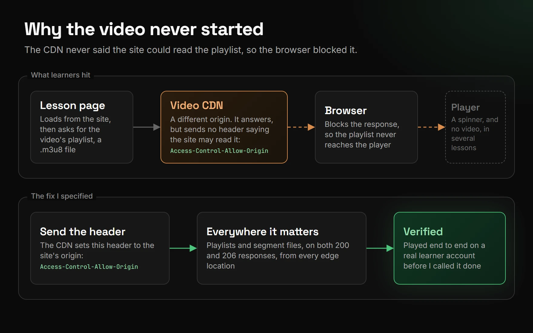
A diagram in two bands. What learners hit: the lesson page asks the video CDN for a playlist file; the CDN, a different origin, answers without an Access-Control-Allow-Origin header; the browser blocks the response; the player shows a spinner and no video in several lessons. The fix I specified: the CDN sends the header for the site's origin, on playlists and segment files, on 200 and 206 responses, from every edge location, then the fix was verified end to end on a real learner account.
Why the video never started, and the fix I specified. A diagram, not a screenshot: the CDN's playlist responses carried no CORS header, so the browser refused them.

Where it stands

From 2022 to 2025, this was the platform the organization ran its public site and course delivery on, and I was its lead developer. My focus now is the integrations, systems, and workflows around it, and championing the design system, now led by a direct report I coached into it. I'm also working to bring the accessibility baseline from this platform to the organization's current site.

Got a hard problem? I’d like to hear about it.