Site for a performer, singer, and podcast host.
Daniella Rabbani
The brief
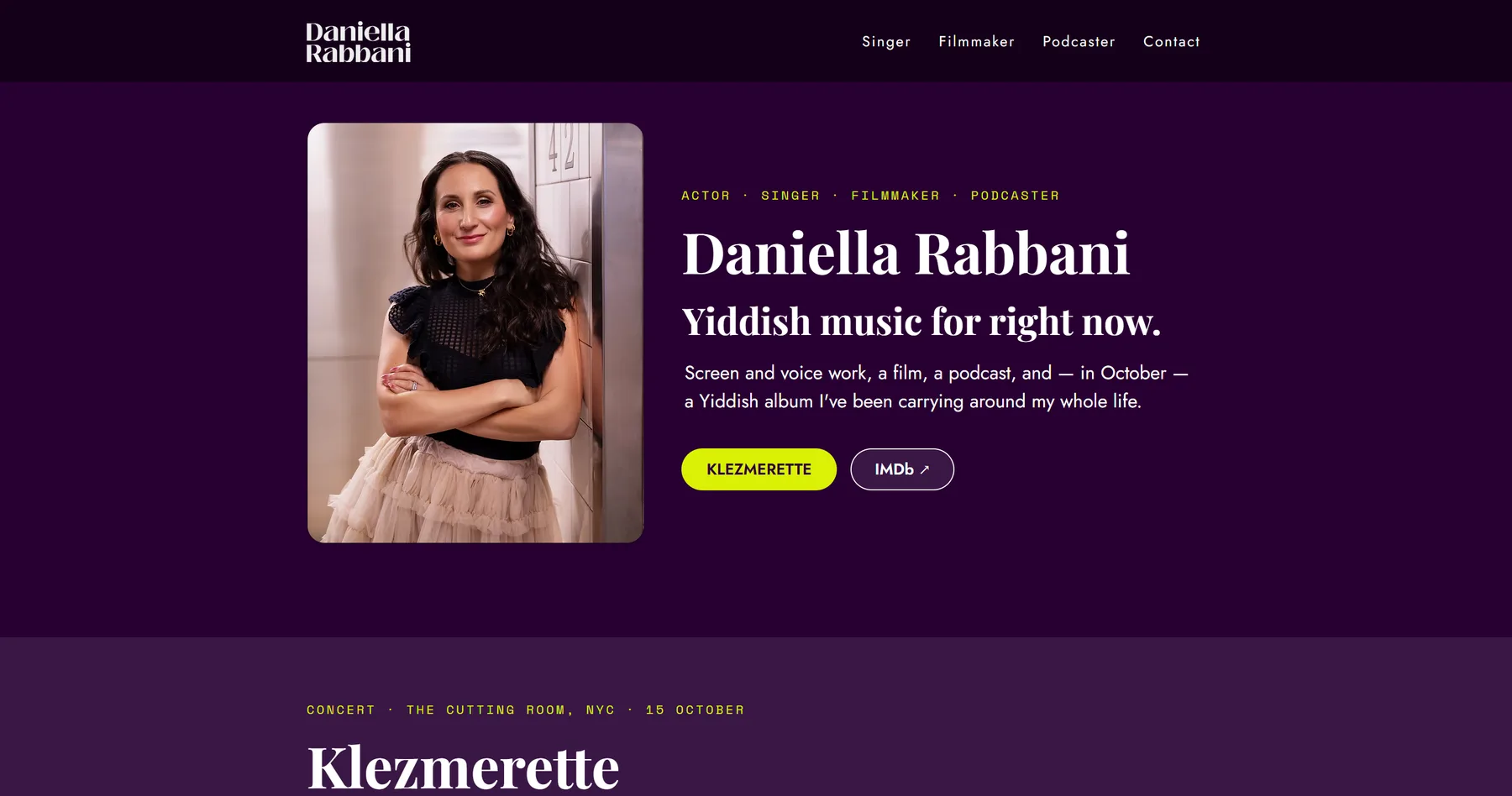
A site for Daniella Rabbani — performer, singer, and podcast host — that could carry a concert announcement, an album release, and casting/booking inquiries at once, without feeling like three sites bolted together.
Before and after
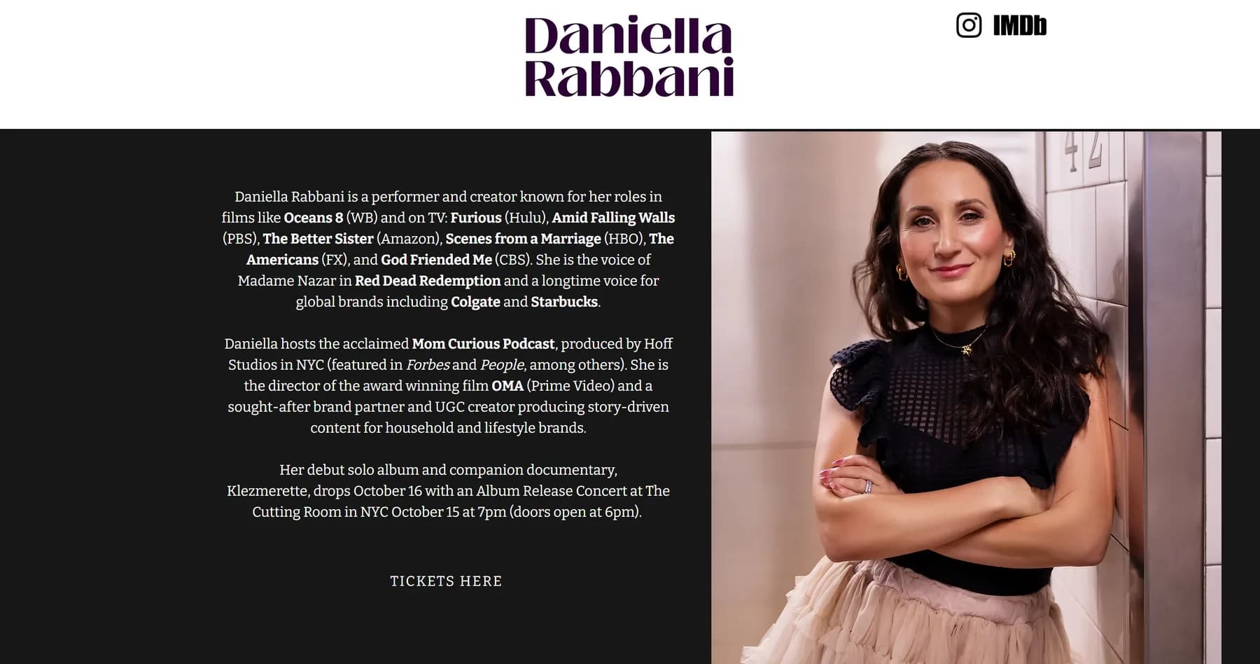
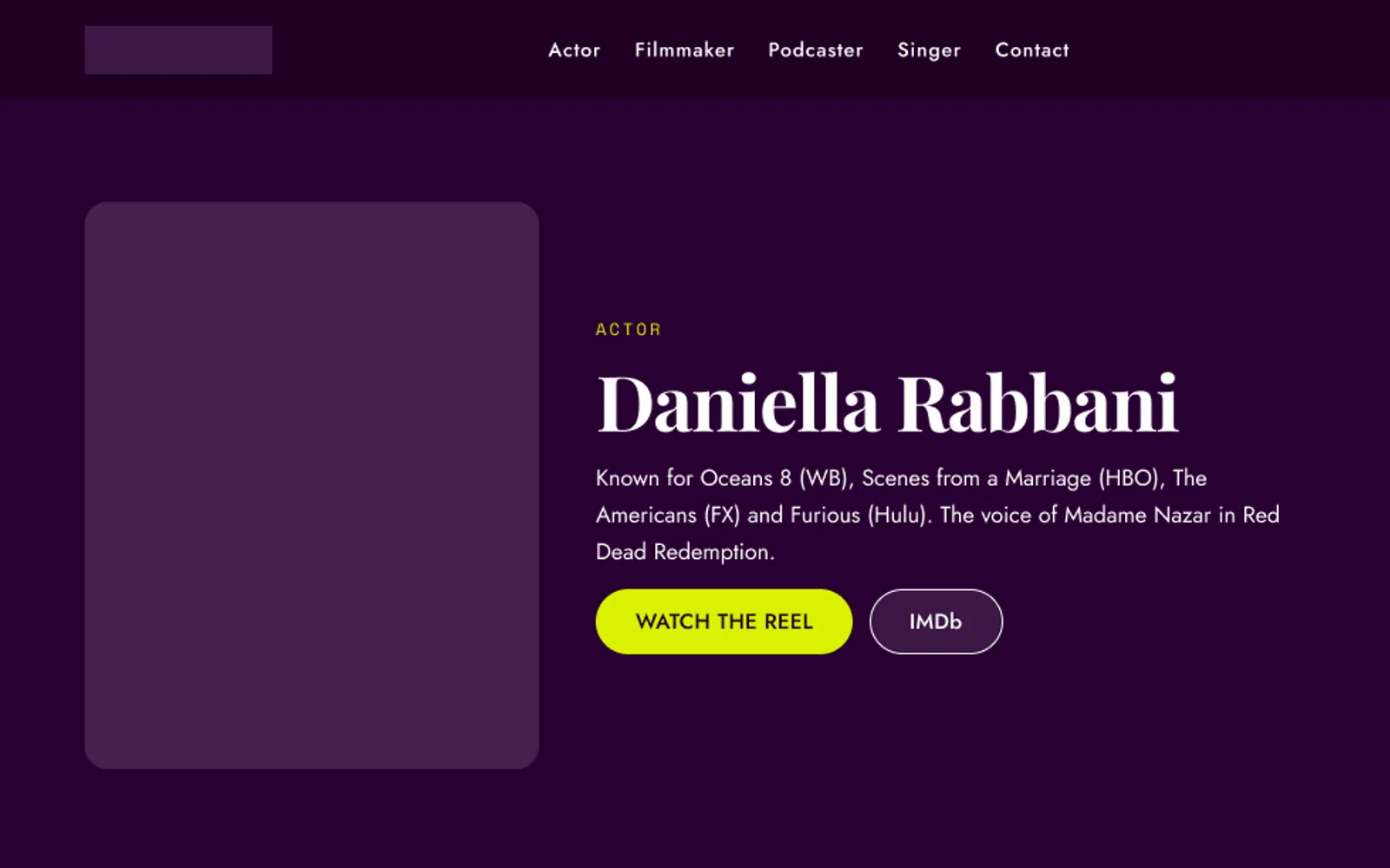
The site she had was one dark section: a long paragraph of credits beside a portrait, a single tickets link, and the contact routes underneath. Everything on it was true, and none of it was easy to find. Drag the divider to compare.

What I built
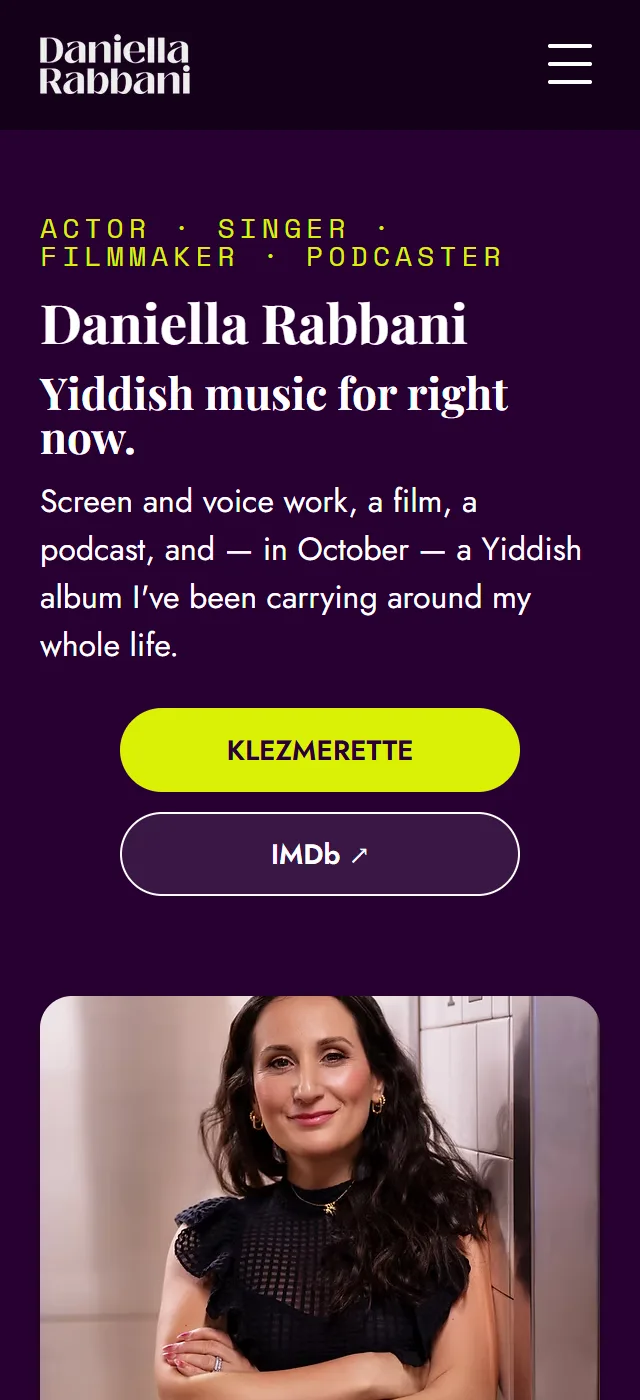
Designed in Figma, with Claude Design in the loop for direction and prototyping, then built in Wix. Design and build, start to finish. The list below is the site at launch; it has been trimmed since, and today it is the hero and the album with the signup and contacts below.
- A dark, portrait-led hero with the album as the one primary button, and a short line instead of the paragraph of credits.
- Four practices, four strips. Acting and the album, the concert, the film, and the podcast each get their own ground color and one action: get concert tickets, watch on Prime, listen on Spotify. A small mono label names the practice and the one date that matters.
- A newsletter signup between the strips and the footer, promising twice a month at most.
- One contact footer routing each kind of inquiry — bookings, management, commercial and voiceover work, the podcast — to the right place instead of a single generic form.
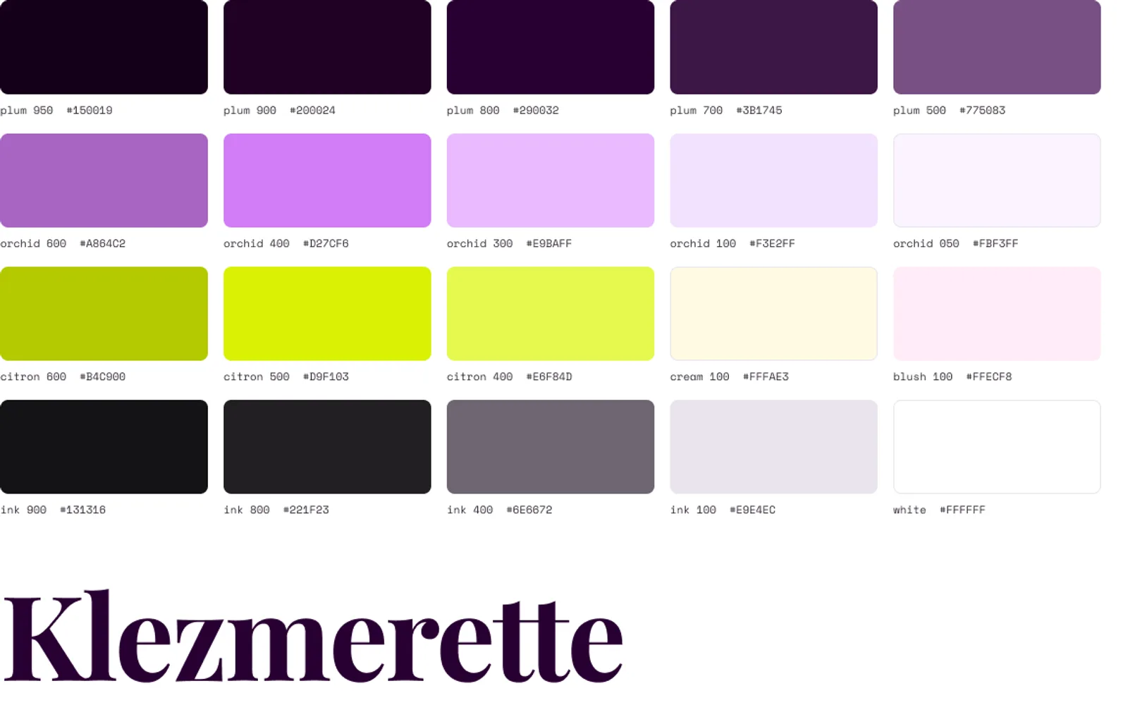
The system
One page, four practices
A fuller version, proposed and not built
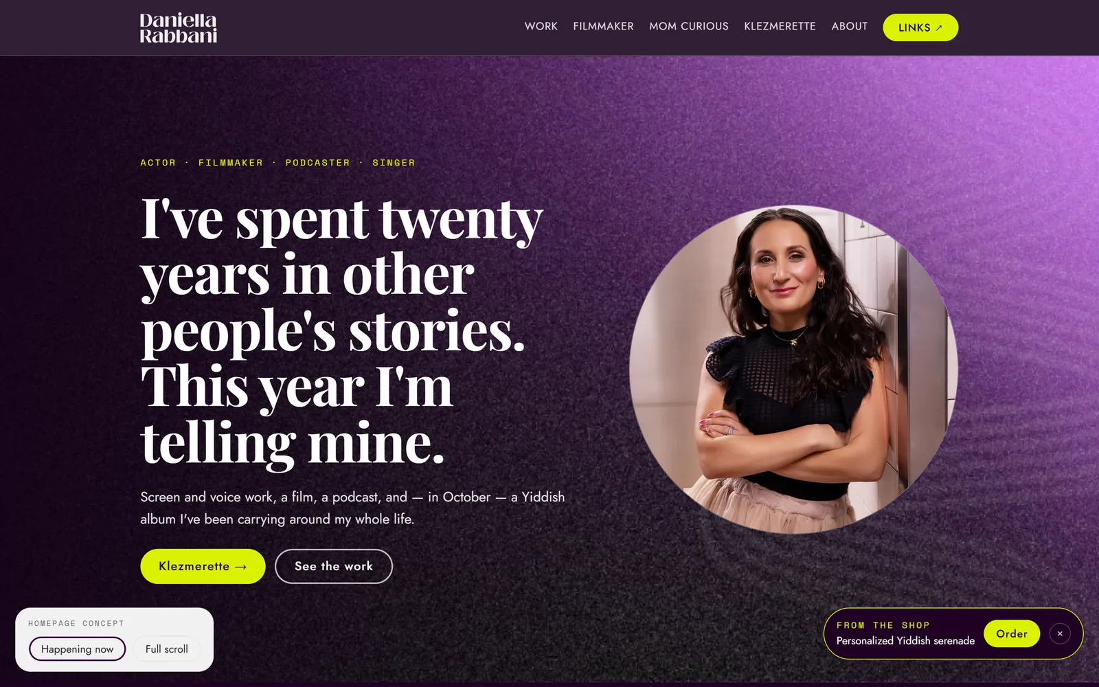
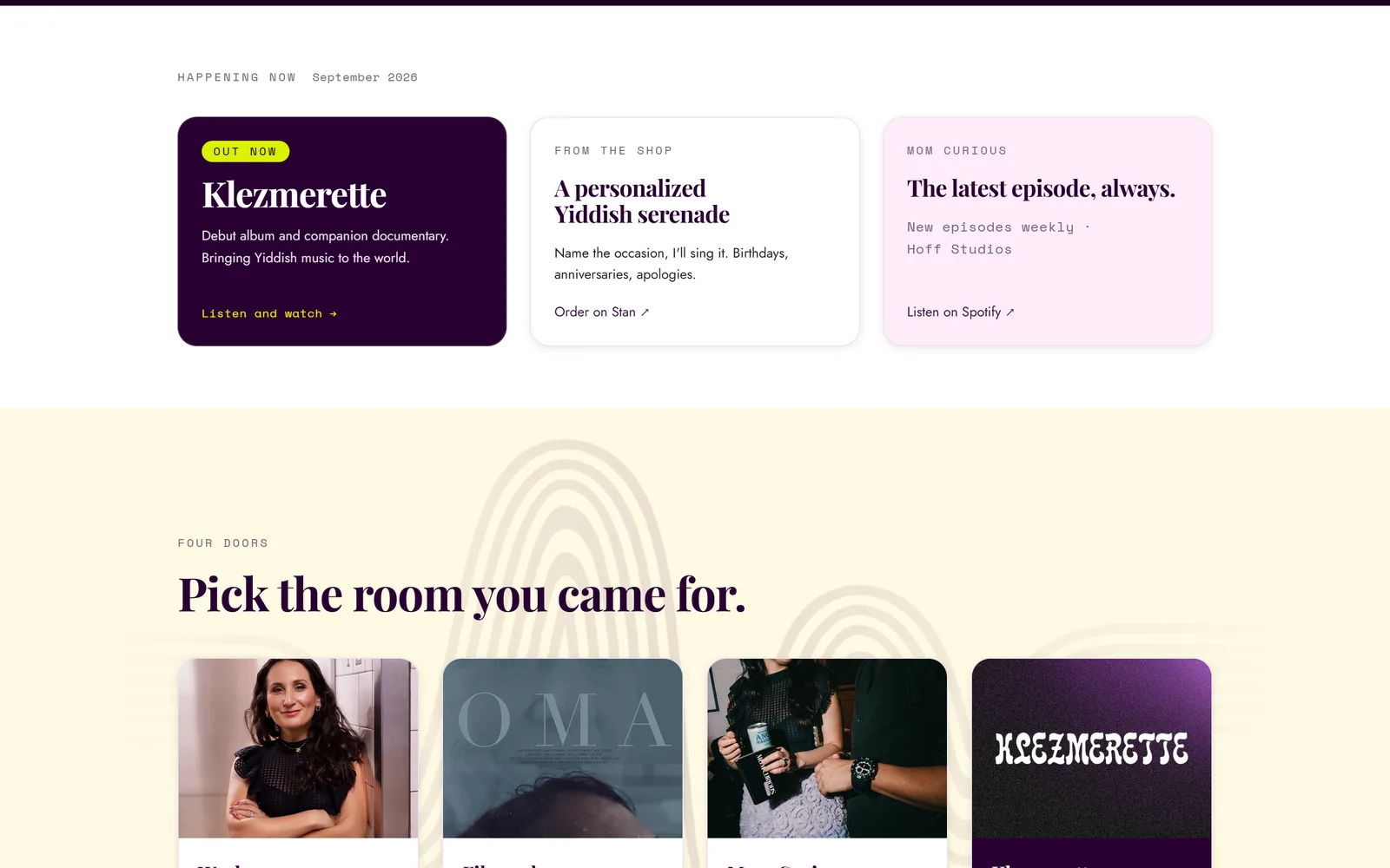
After the first version I proposed a fuller homepage and prototyped it: a textured hero with the portrait in a circle, a row for what is happening this month, one door into each practice, and a slot for her Instagram posts. It's the next phase and hasn't been built yet.
What this taught me
A site that serves four audiences is mostly a question of order: what gets the first screen this month, and what waits. The version that launched answered it with strips in a fixed order. The proposal answers it with a row that changes with the calendar.