The design system behind Koto and Kibi — still being built out.
Intuition UI
RoleDesign system author
Timeline2026
What it is
The design system behind Koto and Kibi — still being built out, not a finished product. It started as packages/ui inside the Koto monorepo: a small set of React components plus a token file, distributed shadcn-style (consumers copy the source, not a package). This case study is here because a system in progress, built alongside the real products that need it, is still worth showing.
- One accent hue and a gray ramp — no second brand color, no gradients in the palette itself.
- Borders do the elevation work: every card is a 1px border, no shadow, unless something genuinely floats.
- Dark-first, with a real light theme built in from the start rather than bolted on later.
- Tokens exist ahead of full adoption — the intent is defined before every component catches up to it, which is the honest state of a system that grows alongside the products using it instead of being handed down finished.
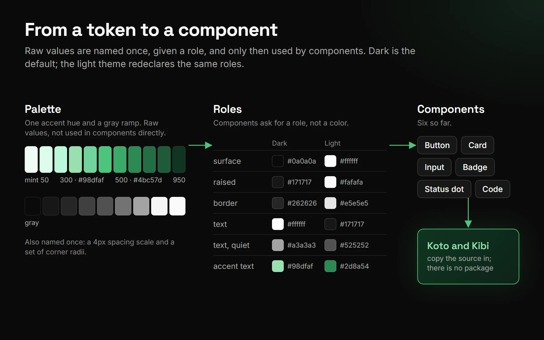
Shown here as work, not as a package — no install instructions, no public repo.